Short answer:
Pick your Transitions® Gen S colour based on how your eyes feel in light — not just how the lens looks in the mirror.
Most people choose photochromic lenses for style. Frame match. Skin tone. “What looks cool?”
That’s fine.
But the real difference between Transitions® Gen S™ colours is how they filter light — and that changes glare, contrast, eye fatigue, and comfort.
I explain this in detail in my YouTube video (linked below), but here’s the practical breakdown for Winnipeg patients trying to decide.
First — what’s actually different between the colours?
All light contains different wavelengths (remember the prism experiment from grade 3 science).
Blue light (short wavelength) scatters more. That scatter = glare.
Red light (long wavelength) scatters less.
Each Transitions Gen S colour filters parts of that spectrum differently. That’s why one tint feels “calming” and another makes things “pop.”
The exact filtration curves are proprietary, but we understand the functional differences.
“I just want everything to look natural.”
Get: Grey
- Reduces light evenly across the spectrum
- Keeps colours true
- Works like a dimmer switch
- Best for brightness sensitivity (not glare)
Great for:
- Everyday wear
- Driving
- People who hate colour distortion
If you want the world to look exactly the same — just less bright — grey is your safest choice.
“The world looks washed out. I want better contrast.”
Get: Brown
- Filters more blue light
- Reduces scatter
- Improves contrast
- Feels warm and comfortable
Great for:
- Golfers
- Cyclists
- Tennis players
- Cataracts
- Early macular degeneration
- Glaucoma
Brown helps objects stand out from backgrounds. If Winnipeg winters feel flat and low-contrast, brown can make a big difference.
“Is green better than brown?”
Short answer: For many people — yes.
Get: Green
- Reduces glare
- Maintains natural colour perception
- Boosts contrast
- Feels easy on the eyes
Green is one of the most underused tints. It gives contrast like brown but keeps colours more natural.
For many of my patients with early cataracts, green is a fantastic balance.
“I’m super light sensitive.”
Get: Sapphire or Ruby
Sapphire
- Designed for very bright conditions
- Reduces brightness
- Less about contrast
Ruby
- Strong glare reduction
- Feels very comfortable in bright sun
- Noticeable colour shift
If your main complaint is “bright light hurts”, these are strong candidates.
“I get headaches in mixed light.”
Get: Amethyst
- Filters green/yellow wavelengths
- Feels calming
- More about comfort than performance
Some patients prone to migraines find this soothing. It’s not about contrast. It’s about feel.
“I want things to REALLY pop.”
Get: Amber
- Filters a large amount of blue light
- Dramatic contrast improvement
- Enhances depth perception
- Strong colour shift
Excellent in:
- Fog
- Snow glare
- Overcast days
- Sports
Amber is powerful. It makes images jump forward. Just know colours won’t look fully natural.
“What’s the difference between Green and Emerald?”
Emerald = green with more personality.
- Similar contrast benefits
- Slightly more colour emphasis
- Less natural than standard green
If you like green but want something bolder, emerald is your move.
Dark vs Contrast — people confuse this all the time
When someone says:
“I want the darkest lens possible.”
They may actually mean one of two things:
- I want less brightness → Grey, Sapphire, Ruby, Amethyst
- I want better contrast → Brown, Green, Emerald, Amber
Those are completely different goals.
What are people in Winnipeg actually asking?
“Which Transitions colour is best for driving in Manitoba winters?”
→ Green or Brown for contrast in snow glare.
“Are grey Transitions better than brown?”
→ Grey = natural colour. Brown = better contrast.
“What tint is best for cataracts?”
→ Brown, Green, or Amber depending on glare level.
“Is there a Transitions colour that helps with headaches?”
→ Some patients prefer Amethyst.
“Which Transitions lens looks darkest outside?”
→ Ruby and Sapphire often appear darker.
“Do Transitions colours actually affect vision or just style?”
→ They absolutely affect contrast and glare perception.
If you want the simplest way to decide
Ask yourself:
- Am I bothered by brightness?
- Or am I bothered by glare?
- Or do I want more contrast?
- Or do I want comfort?
Then match the tint to that answer.
At Waverley Eye Care Centre, we walk patients through this with real-life demos — not just a frame mirror test.
Why this matters more now
Modern LED headlights contain more blue spectrum.
Snow reflects intense blue light.
Screens add cumulative exposure.
Filtering the right wavelengths isn’t cosmetic — it’s functional.
Quick Comparison Table
| Goal | Best Tint |
|---|---|
| Natural colour | Grey |
| Contrast boost | Brown |
| Balanced contrast + natural | Green |
| Maximum contrast | Amber |
| Bright light sensitivity | Sapphire |
| Heavy glare discomfort | Ruby |
| Calming feel | Amethyst |
| Bold green contrast | Emerald |
Want to go deeper?
Watch my full breakdown on YouTube where I show visual comparisons of each tint and explain how they may affect your perception in real-world scenarios.
Come in for a Transitions Gen S Demo
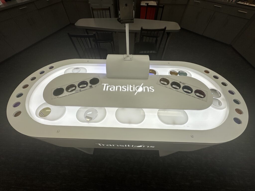
If you’re in Winnipeg and trying to decide which Transitions® Gen S colour fits your eyes — not just your outfit — book an appointment at Waverley Eye Care Centre and try our our Transitions Lumio Bar where you can demo every type of Transitions Lens available.Bring your questions. Bring your sunglasses.
We’ll test what your eyes actually prefer.


